Texture by Next Issue: Better Than It Was. Still Has Room For Improvement
I heard that Next Issue had completely redesigned their app, an all-access pass to over 150 magazines, and called it Texture.
The good news? It’s better than it used to be and does have some nice features. The bad news? People still haven’t figured out how to do enhanced content without being annoying.
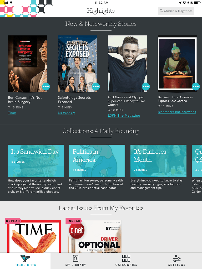
Let’s start with my favorite feature. I’m a huge fan of the Highlights screen.
When the app was still Next Issue, the focus was on downloading and reading entire magazines. That’s not me anymore. With Twitter, Feedly, Facebook and G+, I’ve become site/publication agnostic. I want to read interesting articles, and I don’t have time to open up each of the magazines in Texture to find the handful of articles I’m interested in. I follow a lot of content curators through social media, and they do the grunt work for me. With the Highlights screen in Texture, I’m discovering interesting articles from magazines I don’t normally read, like the article on Costco and American Express from Bloomberg Businessweek. That’s not a magazine I would think of reading, but I was interested in the article.
By the way, the Highlights screen appears to only be available on the iOS version of the app. The Android version on my phone doesn’t have it, which could be a problem if you switch back and forth between operating systems. Also, the Android version doesn’t have the Collections feature from the iOS version, which means I can’t figure out a way to pick up a "Read Later" article from my iPad to then read it on my Android phone. Be warned, if, like me, you use multiple mobile operating systems. You’ll probably want to choose one or the other for Texture.
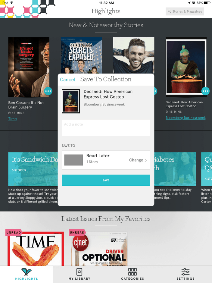
As you can see from the screenshot, it’s easy to save an article for later reading, another feature I’ve gotten used to. When I find something on Twitter that I don’t have time to read just then, I save to Pocket for later. Hint, Texture. Pocket or Instapaper integration would be amazing!
 The reading experience is generally good. I’ve found the app to be responsive and smooth, with few to any lag issues. That’s a big change from previous versions. What I don’t like is how varied the experience can be from magazine to magazine. Some use a continuous scroll. Others use scrolling up and down to change pages. Still others use left/right taps/swipes. I realize Texture has little control over this; it’s based on what the individual magazines choose, but it would be nice if someone enforced some consistency.
Although the app technically works on a phone, I don’t recommend it, not even with large-screen phones unless you have good eyes or high-power reading glasses. One of the disadvantages of digital magazines is that most of the time they are exact copies of the paper issues, with little to no ability to reflow text or change font size. I find some of the magazines difficult to read even on my iPad Mini. The layout looks good, but the font size is often too small. I could only read the afore-mentioned Bloomberg article by zooming in, which made page turning even more cumbersome. First I had to pan and scroll around the page and then zoom back out to turn pages.
It would be great if Texture offered some sort of panel view, as is found on many Kindle Fire publications. If the app has such an option, I couldn’t find it.
Now we’ll get to my biggest gripe, and we need video for you to properly appreciate it.
One of the first articles I discovered through the Highlights screen was a fantastic article on the Disneyworld upgrades. However, before you could actually read the article, you had to wait through an artistic splash screen which took more than 30 seconds to play. There was no way (that I could find) to skip past it, and it played EVERY SINGLE TIME you opened the article.
Folks, I know I don’t need to tell you this, but that is NOT to way to implement enhanced content. It added nothing but frustration to the reading of the article.
So, as I said in the beginning, there’s a lot to like about Texture. It’s certainly a huge improvement over Next Issue, but it still has a way to go before I can recommend spending either $9.99 (for access to monthly magazines) or $14.99 (for access to all magazines, including weekly).
Comments
Nate Hoffelder November 7, 2015 um 11:42 am
I find myself baffled by your description of inconsistent layouts and behavior. What’s the point of combining into a single platform if not to offer a consistent experience?
Can you imagine if Amazon let book publishers decide whether to use "a continuous scroll, scrolling up and down, or left/right taps/swipes" to turn the page?
That would be a mess.
Juli Monroe November 7, 2015 um 4:08 pm
@Nate, agreed. It’s a pretty user unfriendly decision. Magazines still haven’t managed as smooth a transition to digital as books.
Liz November 8, 2015 um 3:05 am
I use Texture and I fnd it a good option for me. I have not experienced the technical issue you descrbed. If I were to subscribe to the digital editions of the magazines Individually, it would definitely costs more than $9.99. People magazine alone runs $9.99 per month. I enjoy being able to read the magazines I want without having to have a bunch of individual subscriptions or having to buy a bunch of individual magazines.