Google Debuts New Literata Font – Two Weeks Ago
There’s a story going around today about the new fontface which Google released with the latest update to Google Play Books a couple weeks back.
Apparently a lot of people are just now noticing that Google has replaced the Droid Serif font in GPB with Literata. This font was commissions from Type Together, a font foundry, and looks completely different from the font it replaces:
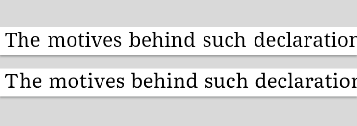
Top: Droid Serif, Bottom: Literata
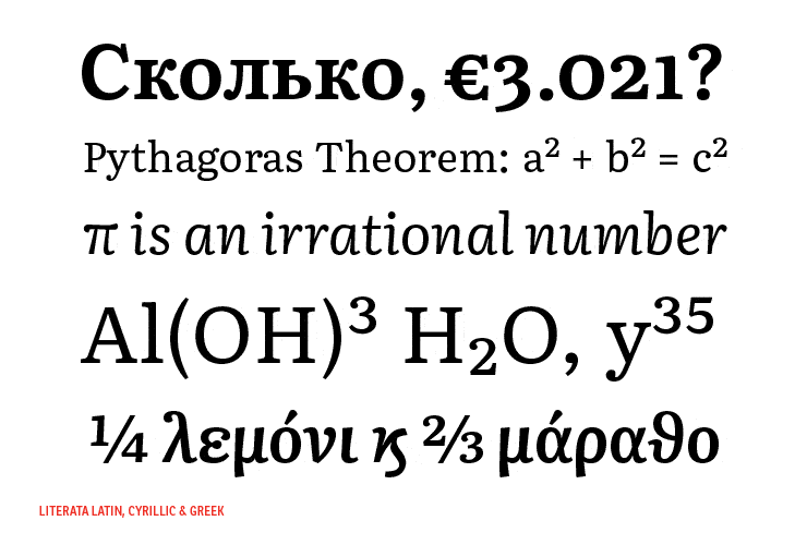
According to Type Together, the font is only going to be used in Google Play Books. They say that "the new Play Books type is meant to establish a recognisable visual identity for Google’s native eBook App and stylistically distinguish itself from other eReader competitors". Type Together has been working with Google for over a year to develop the new font, which includes Latin, Greek, and Cyrillic characters in regular, bold, and italic.
***
Given that Amazon has the Bookerly font, and Kobo has Nickel, I guess that custom fonts are the new ebook fad for the major platforms.
What a waste. While fine-tuned fonts can improve the reading experience, I’m not convinced that investing in a custom font is worth the expense. On the other hand, Apple’s approach of licensing the Helvetica Neue font as a system font on Apple devices might actually be the more expensive approach.
But given that no one has revealed their costs, it is hard to say.

Comments
Muratcan Simsek May 20, 2015 um 2:38 am
I disagree. Apart from Monotype’s eText family, there wasn’t any e-reading focused typefaces and they were just modifications. Now we also have (as far as I know) Kobo Nickel, Bitter (from a personal favorite Huerta Tipografica), Bookerly (from the great Dalton Maag) and Literata from Type Together.
I believe there is a clear need for typefaces specifically designed for e-reading and eInk screens. While Monotype’s eText typefaces are nice, they are not really that.
This new trend is good. Typefaces evolve with mediums used. From quality of paper to the printing techniques, every change in publishing creates new typefaces. Modifications like Monotype did are well and good, but every new medium needs its own character. We should not forget the type is the face of the reading.
Seeing the efforts to design new types for an entirely new reading medium called a waste, especially in a blog for e-reading, is heartbreaking =(
Nate Hoffelder May 20, 2015 um 11:13 am
Sorry, but I’m not convinced that we need special fonts just for e-reading, much less that each majr platform needs its own font.
I don’t see what is so different about reading ebooks as opposed to reading websites. All fonts used in either ebooks or on the web should be optimized for reading (That Is Why They Exist), and so i don’t see why you can’t use the same font for both purposes.
Muratcan Simsek May 20, 2015 um 12:05 pm
For the same reason why there were new typefaces for laser printing and web, like how Charter and Georgia defined laser printing and web typography.
Laser printers printed differently than the old methods, different dpi, different use of material, I don’t think there is any need of explaining here. And then there was Charter.
Computer screens changed the scene again with ppi, pixels, pixel alignments and low resolutions compared to the printing. Then there were Georgia and Verdana.
eInk again is something completely new. It doesn’t have pixels but eInk capsules, therefore it cannot be defined accurately using ppi or dpi. Alignment of the capsules cannot be likened to pixel alignments so hinting should be done differently (existing font files, including Literata, performs much better when one removes the hints for the computer screen). The resolution of eInk capsules are also different to what we know as screen resolution too.
Now, you are correct that modifying old and classical typefaces should work very well, like the Monotype eText family I talked about (Storm Baskerville works very well after some modifications too). Fonts optimized for web wouldn’t do for the reasons I have explained (for starters, one doesn’t read a 1000 pages novel from the web with Verdana), but there is indeed no technical need for new typefaces.
That need lies within the art of typography itself. As I said, new mediums need their own character. Typography is foremost an art and it is expressed in letters. When there is a new way to convey the letters, the artist should of course create new works to use it. Reading on a Kobo feels different than reading a hardcover, a new typefaces should use this difference in the feeling.
Well, if you don’t consider typography an art, you shouldn’t see any need for new types. That is the crux of matter and no amount of discussion would make a difference.
elmimmo May 21, 2015 um 9:22 am
Except that Google Play Books’s most probable reading environment is certainly not eink ereaders.
elmimmo May 21, 2015 um 9:29 am
…and Amazon apparently commissioned Bookerly specifically for Kindle tablets, no their eink ereaders.
Nate Hoffelder May 21, 2015 um 9:39 am
Yep.
Why All Fonts Are Not Created Equal (video) | Ink, Bits, & Pixels May 21, 2015 um 9:01 am
[…] developed the Nickel font for its ereaders but isn't using the font in its iOS apps, or why Google commissioned the Literata font, then I have a video for you to […]
Robert Nagle June 8, 2018 um 1:01 pm
I guess the real question is whether you think fonts make that much of a difference for printed books. I never really noticed fonts on printed books until about 3 years ago. They especially make a difference for Headings.
On Amazon I love Bookerly, but I tire or that even. I don’t want dramatic fonts, but I want a little variety.