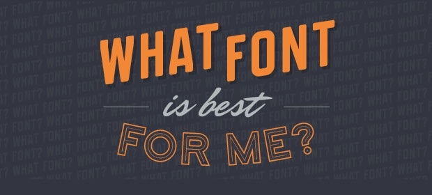
Infographic: Everything You Ever Wanted to Know About Fonts
Fonts make the publishing world go round, but there’s more to a font than just characters on a screen.
As you can see in the following infographic from Cartridge Discount, fonts used for the web differ from ones designed for print (but we already know that). This graphic also explains the difference between serif and sans serif, and how most people have been mistakenly using the word "font" when writing online about "typefaces".
The use of typefaces (fonts) in ebooks is largely left up to what the major ebook platform support, and many have developed their own typefaces. Google has Literata (also Roboto), Amazon has Bookerly, and Kobo has a typeface called Nickel.
This infographic should help you understand why they went through the effort and invested so much money in developing unique sets of the same 26 characters.


Comments
Popup August 11, 2015 um 9:10 am
"For a long time, Sans-Serif was the defacto choice of font for novels and magazines."
In what world was that?
In my experience, we’re only now moving from Serif towards sans-serif, but only slowly. (Especially in novels.)
Maria (BearMountainBooks) August 11, 2015 um 11:03 am
Very cool. I am always looking for new fonts for use on covers.
Infographic: A Guide To Everything You Need To Know About Fonts | A multi-disciplined Graphic Designer and Art Director based in Bristol with a passion for technology and digital design August 12, 2015 um 12:07 pm
[…] to enlarge Click on image to enlarge Click on image to enlarge Click on image to enlarge [via The Digital Reader, Cartridge […]
Todo lo que necesitas saber sobre las tipografías August 12, 2015 um 5:05 pm
[…] pero ¿realmente sabes lo suficiente? Si no aún eres inexperto, una infografía publicada por The Digital Reder puede resultar muy útil, ya que incluye lo básico y otros datos que quizás […]
Liz Weishaar August 13, 2015 um 1:23 pm
Nice looking infographic, but all the grammatical errors set my teeth on edge.
Nate Hoffelder August 13, 2015 um 1:26 pm
I hope you don’t mean errors in the text of my post; I don’t see any and it’s going to be really embarrassing if I missed them.
Frank August 13, 2015 um 1:34 pm
He must be referring to the infographic, the post is fine as-is.
Liz Weishaar August 14, 2015 um 7:58 am
Nope, referring to the Infographic. It’s always a little sad when people can’t use their own language.
New Infographic: Everything You Ever Wanted to Know About Fonts – Stephen's Lighthouse August 19, 2015 um 6:01 am
[…] https://the-digital-reader.com/2015/08/11/infographic-everything-you-ever-wanted-to-know-about-fonts/ […]
#Infographic: Everything You Ever Wanted to Know About #Fonts | The Digital Reader #typefaces #typography | infophile August 20, 2015 um 5:12 am
[…] As you can see in the following infographic from Cartridge Discount, fonts used for the web differ from ones designed for print. This graphic also explains the difference between serif and sans serif, and how most people have been mistakenly using the word “font” when writing online about “typefaces”. via Infographic: Everything You Ever Wanted to Know About Fonts | The Digital Reader. […]
Font selection | Making Book November 8, 2015 um 10:35 am
[…] info graphic (delivered via The Digital Reader) does briefly address this “confusion”. Can the assertion that sans serif typefaces […]