How to Get the Most Out of Your Dasung Paperlike, or Other E-ink Monitors

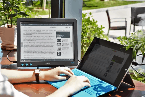
Dasung Paperlike Pro, with an iPhone
E-ink monitors like the Dasung Paperlike Pro are still a niche product, and an expensive one at that. This unfortunate combination means that users will have shelled out a lot of money and then had trouble finding help with their new device.
That is exactly the situation I found myself in when I got a Paperlike. I wasn’t terribly happy with how Windows and the apps I use everyday looked on my Paperlike, and I couldn’t find advice on how to make everything more legible on an E-ink screen.
I resolved the issue by simply going back to using a regular monitor, but that simply isn’t an option for those who get migraines from staring at LCD screens.
So when the Paperlike Pro came out, I went looking for ways to make apps look their best on the new monitor. I have so far solved three of my problems, and I hope by sharing them that I can help others crowdsource solutions to their issues with E-ink monitors.
What We’re Going to Do
In general terms, what we need to do to get the best performance from an E-ink monitor is to look for "high-contrast", "color blind", or grayscale options.
What these options will do is change the colors displayed on a screen from bright colors to shades of gray. These options were originally developed for users with vision problems, but they can serve a dual purpose by making your computer work better with an E-ink monitor.
Here are a few of the grayscale solutions I have found.
Windows
I can’t say for sure whether this works on other versions of Windows, but Windows 7 has a high-contrast mode. It only works on the Windows desktop and menus but not app icons or app content, so it’s only a partial solution, but it does make it easier to navigate Windows.
You can enable the high contrast mode by pressing alt+ (left) shift + Print Screen. (source)
Chrome
I spend most of my day in Chrome, so after I had Windows squared away I went looking for a way to make Chrome look better on an E-ink screen. I found a solution, but it turned out that I need unique solutions for most of the websites and services I use.
The general solution for Chrome is an extension called Gray Scale Black & White. It changes all the colors in Chrome to shads of gray. It works wonders on Twitter:


This is a great solution for a lot of sites, but it also causes problems for WordPress and Gmail (and probably other sites I have not identified yet). They both became illegible when viewed on my Paperlike Pro.
Fortunately, this was an easily solvable problem.
Gmail
The trick to making Gmail look good on a grayscale screen is to switch to a different color theme. Gmail, has over 4 dozen theme options, including a light gray option that is the next best thing to grayscale.
The gray theme looked great on my Paperlike Pro.
You can change the theme by clicking the "gear" menu button, selecting the "Themes" option, and then scrolling down until you see the gray theme option.
WordPress
There are a couple ways to make the admin pages for a WordPress site look good on an E-ink screen.
One option is to change the color theme. WordPress offers a dozen color themes for its admin pages, and I thought the "blue" theme was the most legible of the default color schemes on my Paperlike.
But I would not recommend that you enable it, because I have a better option.
What you should do is install a couple plugins, Fix Admin Contrast and High Contrast Admin. These plugins were designed to make existing admin menus easier to see by improving the contrast, and they work. They make the menus easier to read on my LCD screen.
But they don’t help any on my Paperlike. In fact, they conflict with the GS B&W plugin, and make the menus even harder to read.
Fortunately, that problem has a simple solution.
The High Contrast Admin plugin also comes with its own custom color themes (two, to b exact). I have found the "High Contrast White" option looks best on my Paperlike Pro.
It’s not perfect, but it is so close and is so much more legible than any other solution I have found that I am willing to forgive its shortcomings (the plugin menu is difficult to see, though).
All in all, the solutions I found have made my Paperlike Pro much more useful that when it came out of the box. It’s gone from being an interesting curiosity to a screen I might start using on a regular basis.
So, what solutions have you found for using an E-ink screen as a monitor?
Do you have a problem you can’t solve? If so, leave comment and let’s see if other users can help fix it.

Comments
Jyri September 17, 2017 um 11:35 pm
Great article! Just he situation I am facing with my new Paperlike Pro. I have the problem that even text in ms word is not nearly as clear as in an ebook reader. Usable though. I use 1600×1200 resolution with floyd. I also wonder if some computers/OS is better suited with this screen than others? Since I’m going to buy a new one. Anyways, I use this as my main screen now. Great invention!
Gordon September 23, 2017 um 6:11 pm
I was wondering, isn’t the PPI (150) a little low for text to be readable at this small screen size, especially when rendering serifs? How is your experience with it?
Nate Hoffelder September 23, 2017 um 6:18 pm
First, the nice thing about an E-ink screen is you can put it almost against your nose without harming your eyes.
But no, I don’t think the Paperlike’s screen isn’t sharp enough. My laptop has a 13.3″ screen at 118 PPI, and the Paperlike’s screen is sharper than that.
Fran September 25, 2017 um 9:22 am
The first Dasung Paperlike was so buggy, I was never able to really use it. The screen kept refreshing itself every few minutes (going completely blank and losing the connection to the computer before coming back on). It was completely unusable and support didn’t really help, so I basically invested 1.000€ in vain. Do you know if the new Pro version is bug-free? I am not going to invest again without being completely sure.
Nate Hoffelder September 25, 2017 um 9:34 am
The Pro loses the signal about every 3 or 4 minutes. Pressing the reset button brings it back, though.
I can understand why you found the first model unusable. It really was (the drivers were shit). On the other hand, I use the Pro everyday.
The Dasung Paperlike Pro E-ink Monitor is What Every Author Needs | The Digital Reader September 25, 2017 um 1:46 pm
[…] takes a lot of software tweaks to really make web browsing […]
Colin June 10, 2020 um 11:39 am
If anyone’s using the Atom text editor, I’ve been working on an e-ink-oriented syntax theme that is specifically intended to look good and reduce flicker on paperlike monitors. https://atom.io/packages/e-ink-syntax