Torture the Designers in Your Life With the Hellvetica Font
I just found my next April Fools Day joke. Fast Company brings our attention to the news that someone has taken the Helvetica font and made a version designed to torture designers everywhere.
It’s called Hellvetica.
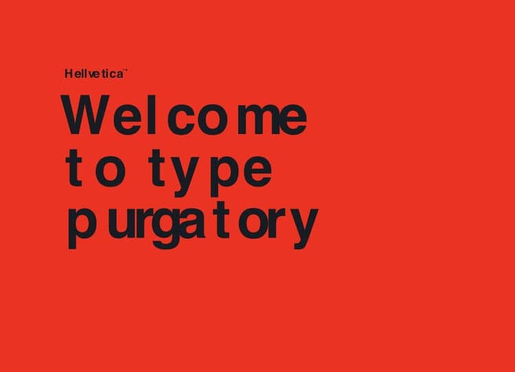
As you can see in the above photo, Hellvetica is designed to have screwy kerning. While each character is the same as in the classic typeface used as the source, Hellvetica utilizes inconsistent, variable spacing between each character to create a look where something has gone terribly wrong.
From FC:
While each character has the same form as the classic typeface it’s riffing on, Hellvetica utilizes inconsistent, variable spacing between each letterform to give an overall effect that something has gone terribly astray. Nope, that wasn’t a mistake. You might just say it was intentionally erroneous.
You can download from its website. How you use it is up to you.
You might, for example, add the font to your victim’s Kobo or Kindle ereaders, and then change the font setting. Or you might install the font on their computer, and change their preferred email app, web browser, or writing app to use this font.
Yes, i do know that is evil; that’s what makes it so much fun.


Comments
Koen Van Praet November 8, 2019 um 7:16 am
So funny evel.
Thanks for the suggestions too!