“Times Uncertain” Font
If you have ever tweaked the text on a book cover, advert, or internet graphic then you’ve probably at least experimented with changing the spacing between characters in order to either improve readability or convey meaning.
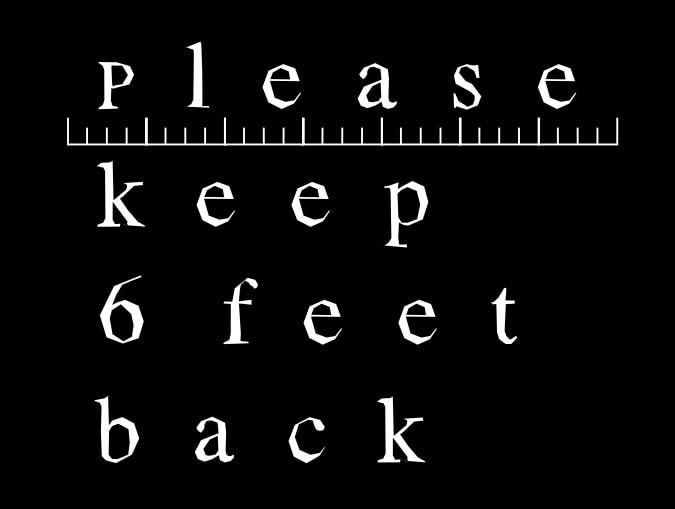
A newly created font called Times Uncertain plays on this concept. It was developed by Third Street Attention Agency based on Times New Roman, only now the well-known font has greater kerning between the characters. The characters have also been distressed to better convey how the current times are fraught with uncertainty.
It’s pretty cool, but I think the point would get across better if the characters showed signs of an improper print job – some parts would be overly thick, while others would be almost translucent or splotchy.
Comments
Allen F May 16, 2020 um 11:39 pm
Bold every other one. 😉
actualitté.com | "Times Uncertain", une police qui pratique la distanciation des caractères | La revue de web des livres May 20, 2020 um 4:09 pm
[…] via The Digital Reader […]
“Times Uncertain”, une police qui pratique la distanciation des caractères | sephatrad May 21, 2020 um 3:24 pm
[…] via The Digital Reader […]