RGB, CMYK, and Why Your Printed Handout Has Different Colors From the Digital Source

You’ve ordered business cards and other documents from printers before, right? Did you ever wonder why the colors sometimes looked muddy or muted compared to the digital source?
No?
Then you are lucky. I just had to discard an order of business cards because the colors were too muted to really catch the eye (I don’t always use brightly colored business cards, but this time it was important). Luckily for me, Vistaprint has a very customer-friendly refund policy, or I would have had to either eat the cost or use the cards.
I’d like to share a trick I learned this week, and save you from running into the same problems I did. It all comes down to color, and how the colors on your screen are created using different shades from the ink colors used to print a document.
RGB vs CMYK
The most common standard for displaying color on screen involves shades of red, green, and blue light being emitted from the screen. This is commonly referred to by the acronym "RGB" or as the RGB color model. It can’t display all colors, but by combining two or more primary colors a screen can show you everything from white ( red plus green plus blue) to cyan (green plus blue), magenta (red plus blue), and yellow (red plus green). (Wikipedia)
Printer ink, on the other hand, uses a different standard set of colors: cyan, magenta, yellow, and black (CMYK, or the CMYK color model), and depending on the sophistication of the printer, it may even have more inks. For example, white ink is a popular fifth color, due to the fact that CMYK can’t display white (it is assumed you are usually printing on white paper and if you want white then no ink will be deposited). (Wikipedia)
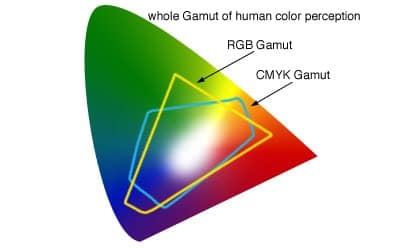
There are many technical differences between the two color models, but the important one here is that they don’t line up for easy conversion. There are some colors you can do in RGB that you can’t do in CMYK, and vice versa.
This usually isn’t a problem because designers are used to designing for both color gamuts, and printers are used to getting RGB images and will automatically convert them to CMYK. This is why you may never have heard of this issue until I brought it to your attention.
To give you an example, if you have POD books with Createspace or Ingram and they have never said anything to you about CMYK or RGB, that is because they fixed this for you behind the scenes.
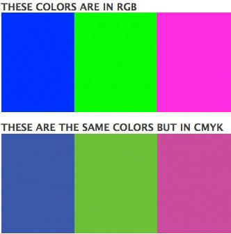
But sometimes you choose a color that doesn’t covert well, and as a result the print product will have muddy colors compared to the digital original.
Again, you may never have to worry about this; I’ve been having stuff printed for 15 years, and I only had to learn about this issue this week because this one time the colors had to be perfect and they weren’t.
But I want to save you from learning this lesson the hard way with your next print project, so in the interest of helping you learn from my mistakes, here’s how you check to see if you have a color issue
If you have Photoshop or another professional image editing tool, you can change the color model in one of the settings menus, then save the image and see how the colors changed. Or, you can have your graphic designer take care of it.
I don’t have a sophisticated image editing tool; instead, I use free online tools (and when that doesn’t work, I hire an expert). So when I had to fix the colors on my business cards, I found a couple automated online tools that did the job.
Once you have run your images through the conversion tool, you should compare them to the original. Make sure the colors match; if they don’t then you may want to seek expert help in either matching the colors or finding alternatives that look okay.
When I set out to fix my color issues, I ended up choosing different colors that were brighter and that I knew would be compatible with CMYK, but that may not be an option for you.
Questions?


Comments
Chris Kantack November 11, 2018 um 9:47 am
Thanks for the heads up and tips for preventing this issue! Rare that any article addresses this topic.