This Typeface Simulates Reading with Dyslexia


Daniel Britton doesn’t have to wonder; he’s had the condition all his life, and now he’s found a way to communicate it to others.
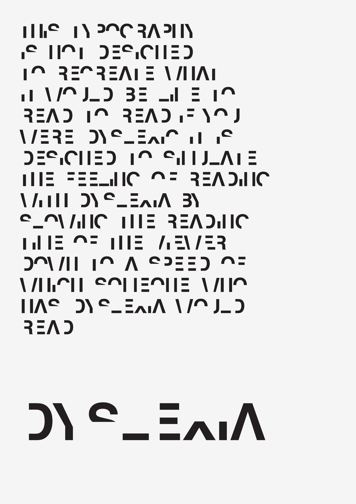
Last week this UK-based graphic designer announced that he was working on a new typeface which is designed to show those who don’t have dyslexia what it is like to try to read a text when you have the condition. It is not yet finished, but the early samples offer a glimpse of what it’s like to have dyslexia.
"What this typeface does is break down the reading time of a non-dyslexic down to the speed of a dyslexic,' he wrote on his site. "I wanted to make non-Dyslexic people understand what it is like to read with the condition and to recreate the frustration and embarrassment of reading everyday text and then in turn to create a better understanding of the condition."
Language-based learning disabilities reportedly affect one in five students. Dyslexia is the most common, with an estimated 5% to 7% of the population coping with it in their daily lives.
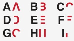
Britton created the font by removing key lines from every letter, making it more difficult to interpret words and sentences. Around half of each letter has been removed. According to Britton, that is enough to slow down your reading comprehension to about the same level as if you were reading with dyslexia.
Try reading this sample, and see how well you can do:
It’s not easy, is it?
While I could figure out most characters and words from the context, some of the words still stump me. In particular, the shorter words didn’t offer enough detail to deduce their meaning.
Did you have trouble reading it?
Daniel Britton via MustReads.nl, CNN

Comments
Morning Links: Typeface Mimics Dyslexia. Why Apple Might Become a Bank – TeleRead: News and views on e-books, libraries, publishing and related topics June 23, 2015 um 7:49 am
[…] This Typeface Simulates Reading with Dyslexia (Ink, Bits & Pixels) Daniel Britton doesn’t have to wonder; he’s had the condition all his life, and now he’s found a way to communicate it to others. […]
Understanding Ebook Production (and Why You Might Want to) | Digital Book World June 23, 2015 um 8:06 am
[…] Visualizing Dyslexia (Ink, Bits & Pixels) As publishers continue to think through accessibility issues, one graphic designer has come up with a compelling way of representing a common reading disability. This typeface approximates how a dyslexic reader might perceive a passage of text. Related: Five Typographical Tips for Ebook Publishers […]
Michael W. Perry June 23, 2015 um 3:38 pm
Aside from "Read," which was relatively intact, I could make little of it. Battling this must be very frustrating, particularly when others don’t seem to have the same trouble.
If there’s a special font that makes reading easier for dyslexics, then every digital device should include it.
Nate Hoffelder June 23, 2015 um 3:42 pm
There is such a font, but experts dispute its effectiveness.
DavidW June 24, 2015 um 11:10 am
This is not an honest analogy. While many suffer from dyslexia, only a small handful of those suffer from letter-by-letter dyslexia which is caused by a lesion in the brain.
I’m not trying to belittle those like the author that have severe letter-by-letter dyslexia. But I think that it should be known that it is a broad category of different types of reading disabilities and not one single disorder.
This Font Will let You Know That the NSA Thinks You're a Terrorist | The Digital Reader July 13, 2015 um 1:51 pm
[…] seen fonts designed to foil OCR apps and to show what it was like to read if you have dyslexia, and now a designer has developed a font which is intended to remind us that the NSA is always […]