Video: Why eBook Text Layout is Terrible
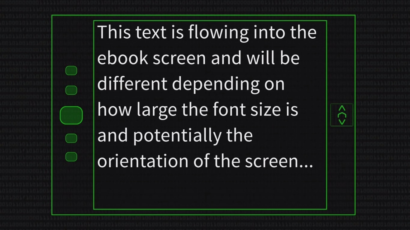
Ever wonder why the ebook you’re reading on a Kindle rarely looks as nice as the edition?
Computerphile sat down with Professor Steven Bagley of the University of Nottingham, who takes us through the steps involved in auto-formatting a text on an ereader. As Bagley explains, good formatting takes a lot of processing power to run a lot of calculations. Most ereaders are relatively under-powered machines which are really doing the best they can.
But to be fair to current ebook readers, things might be less than ideal now but they used to be worse. The algorithms used to layout text now are significant improvements on ones used a decade or more ago.
What’s more, the general quality of ebook design has improved drastically since the Kindle launched; I have ebooks in my Nook library which date from before the Kindle era and are so painful on the eyes as to be unreadable.
Coincidentally, this also explains why there is a solid minority of ebook lovers who insist on user-controlled formatting. Our familiarity with bad formatting has instilled a desire to control the formatting ourselves. And even after the quality of formatting has improved, many of us still want to choose our own formatting options; our personal solutions might not look the best but the personal nature of the formatting decisions adds a degree of emotional investment (everyone loves their own work).
Comments
DaveMich October 16, 2014 um 11:07 am
If there is a special place in purgatory for boring people, then it has a small alcove for people who care about "book formatting."
Moriah Jovan October 16, 2014 um 1:39 pm
Especially if one’s livelihood depends on caring, striving, doing better.
Capitalist pigs.
doubleshuffle October 16, 2014 um 1:47 pm
Well, I think there’s a special place in purgatory for all those people who make the world ugly by not caring for beauty, and that place has a transit lounge for those who don’t care for book formatting.
Nate Hoffelder October 16, 2014 um 4:23 pm
Not to pick a side, but I thought the comment was funny. That’s why I let it through.
Al the Great and Powerful October 16, 2014 um 4:38 pm
"Crimes against formatting?" Really? "Making "… the world ugly by not caring for beauty…"? Seriously?
There’s beauty, and there’s polishing a… well, there’s painting the rocks in the yard, chrome-plating the christmas tree, and so forth. Art for art’s sake can go hang.
I read for content first and foremost. Format and Layout only matter insofar as they serve me the content while staying unobtrusive. I am not viewing art, I’m reading a story, or a file, or a document. Show me the words, and stay out of my way. Let me set narrow margins and flow text so i can read as much as fits on the screen and it is all good.
I’m not opposed to the creation and display of art, but if I do choose to read an art book or document, I’ll read it on a computer with a screen big enough to display a pdf, so I can see it in the artist’s desired layout, not on my tablet’s little screen.
Nate Hoffelder October 16, 2014 um 4:48 pm
I know people who take formatting seriously enough that they are unhappy with even the very adequate job the Kindle does now. That’s why I used the word "crimes".
Doug October 16, 2014 um 4:54 pm
The formatting would be significantly better if auto-hyphenation was included, especially if the publisher could override the auto-hyphenation in special cases.
Nate Hoffelder October 16, 2014 um 4:57 pm
Indeed. My blog theme has auto-hyphenation, and it helps a lot.
Rob Siders October 16, 2014 um 7:00 pm
Some reading systems allow this, notably iBooks and Adobe DE/RMSDK. Also, if an enterprising ebook maker wanted to take the time, he or she could insert code for discretionary, or soft, hyphens in every monosyllabic word so that Kindle will employ hyphenation. The ROI on that endeavor, though, is lousy.
Al the Great and Powerful October 16, 2014 um 5:10 pm
I’m tetchy about the subject because I’m currently fighting this same look versus content battle with our editor at work. Content is what we get paid for. Anything that impedes content is double-plus ungood.
Nate Hoffelder October 16, 2014 um 5:16 pm
That is understandable. And still, I could have been less snarky.
Al the Great and Powerful October 16, 2014 um 5:28 pm
I have read articles and comments like that too, Nate, and I can appreciate their concern without sharing it.
My problem is that the pro-format focus often seem to be more about polishing (touting fonts that they prefer, arguing over which justification is better, and so on), which makes the document look different but doesn’t help communicate the content any better.
Al the Great and Powerful October 16, 2014 um 5:29 pm
I’m happy to argue it, and i do agree that there ARE crimes against formatting (Comic Sans, for instance)…
Nate Hoffelder October 16, 2014 um 5:46 pm
Actually, comic sans some value in terms of early literacy; it is easier for beginning readers to understand than other fonts. (But that doesn’t justify using it elsewhere.)
Al the Great and Powerful October 16, 2014 um 6:37 pm
Cool, I never knew there was any utility for it at all! I only use it to respond to our editor’s foolish decrees…
But I’m not against font variation, I’m just not seeing a genuine need to vary them often.
I’ve got my own font collection, but i still favor a scant handful of them for daily use because they do the job well enough for what i do. YMMV.
I’m not here to preach about what others should do, as long as they don’t try to screw with my patch either…
Joe October 16, 2014 um 8:33 pm
For books with tables and equations the formatting is a big deal, and sadly are often practically unreadable on a kindle.
AltheGreatandPowerful October 16, 2014 um 8:47 pm
What kind of knucklehead tries to read books with equations or tables on a Kindle*, a small-screen reader? Do you also try to read those on your phone?
The engineers and who read plans in the field out here wouldn’t be caught with anything smaller than an iPad, because you need enough screen real estate to see what you’re looking for.
But if you insist on reading documents whose format is important, and you must read on a small screen, why are you not using a tablet, with easy zoom features? A Kindle doesn’t make a good screwdriver, or a good hammer either.
Al the Exasperated
*And if you’ve got a Kindle DX, you can read full-sized book pages with tables and tiny notes just fine in PDF. I do on mine, with my bad eyes.
Moriah Jovan October 16, 2014 um 10:29 pm
This is my idea of “beautiful” for a fiction ebook: As little hard coding as possible so as to allow the reader to read how s/he wants. The dilemma is explaining this to clients who want it to look a particular way, who don’t read ebooks but somebody told them it needed to be on Kindle, who don’t understand a word I say. They just want “to epub.”
Nonfiction’s a little (a lot) trickier because some of it really has to look a certain way, but I don’t do fixed layout. But those clients are usually at least marginally aware of the difficulty of what they’re asking for. I do my best to approximate the PDF layout.
My idea of a “beautiful” ebook isn’t to make it look like print. It’s to make it readable and able to look however the reader wants it to look.
Andrew Gilmartin October 17, 2014 um 2:46 pm
The problem stems from using visual design features that were designed and refined for a fixed content, and a fixed size page and/or double page spread. There are examples today that are taking the steps needed to design a new visual + dynamic language for documents. When these become more broadly adopted I don’t see us missing the widows and orphans.
Tom Krantz June 14, 2016 um 3:12 pm
Wonderful! Would you please identify some of these examples. When, do you imagine, these might these be adopted by the commercial reading machinery (Kindle, KoBo, etc.)?