Authors Abusing Readers

![PublisherFontsOff[1]](https://the-digital-reader.com/wp-content/uploads/2013/02/PublisherFontsOff1-375x500.gif)
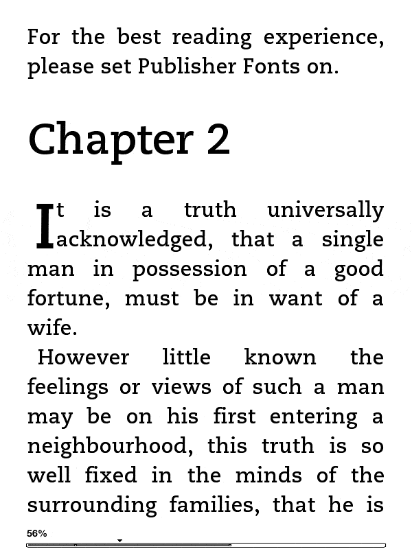
You can see the trick at right. It’s the top 2 lines of text.
Friars Lane Digital Services has figured out a way to nag the reader about enabling the publisher recommended fonts on the Kindle. The nag message shown at the top of the image is written in a special font that replaces all of the characters with the space character.
If you can see the warning message then the publisher recommended fonts are not enabled. Looking at it strictly as a technical trick, it’s pretty cool.
While I appreciate it on a technical level, let me also say that if anyone copies the trick mentioned in this post and uses it in an ebook I will confiscate your ereader. I will also tell everyone that you have developed your own font that combines design elements of Papyrus and comic sans.
So don’t use it.
Baldur looked at this trick and wrote a post about respecting the reader. He argues that readers who choose not to use the specific settings picked by the author or publisher should be allowed to make that decision without harassment.
I do agree with him but there’s also a more important issue here.
Consider for a moment the people who need a larger font size, or a specific font choice. There are any number of readers with mild visual impairments who have adopted ebooks because they no longer have to depend on large print books, services like Bookshare, or custom reading equipment. And with the aging of the US population, that group of readers is growing at a prodigious rate.
That said, I think anyone who uses this trick misunderstands their relationship to the reader. I’m sure a lot of authors would like to see themselves as a chef who prepared a gourmet dish to be enjoyed by the customer.
Go ahead and think that, but also know this. Only the most vain chef, one enthroned in their own restaurant, would have the gall to tell customers that they are applying the wrong seasoning.
Don’t be that guy. I know most wouldn’t like being told that by a chef, and similarly readers don’t like being nagged by obsessive authors and publishers.

Comments
Juli Monroe February 8, 2013 um 9:40 am
Wow, that’s rude! And arrogant. And now I’m running out of further things to say. I’ve enabled publisher fonts on books before and gotten horrible sans serifed things. Not a fan. Definitely don’t want someone nagging me to do it.
Love your remedy, though. Papyrus/comic sans would be a terrible thing. Even though Papyrus is one of my guilty pleasures. My publisher used it for call-outs on my book, without knowing how much I loved it. For an entire book, though? Shudder!
Popup February 8, 2013 um 10:10 am
I must admit that I don’t find it overly offensive. Sure, it’s a bit patronising, but it’s also a neat way of communicating to the reader that the publisher has taken the effort of matching the contents to a specific font. As long as it only occurs once in the very beginning of the book I could live with it.
I generally pick my own font with care – I have over the last year gradually converted to sans-serif, and today I prefer reading with Verdana, but for some subjects a more serious-looking serif font may work better. I really don’t like slab serifs though, so that font would probably be replaced by Palatino, or something similar.
Popup February 8, 2013 um 10:40 am
Actually – looking at it again, it looks like it appears (at least) once per chapter. That makes it way too intrusive for my taste.
Name (required) February 8, 2013 um 10:52 am
Cool, huh?
No. *Bloody* arrogant.
As long as it appears only once in the entire book, I am willing to overlook the bad behavior.
If it is in many places in the entire book, then I am going to write a 1 star review and DEMAND my money back.
Nate Hoffelder February 8, 2013 um 10:56 am
Yes, it is quite rude, but I like it on a technical level.
Name (required) February 8, 2013 um 12:10 pm
Yes, from a point of technical level it is rather clever, but guessing from the context I think that this appears at least once per chapter. That would make it very annoying.
I HOPE this doesn’t occur more frequently or that the chapters aren’t very short. In that case I would grab a pitchfork and try to to take justice into my own hands.
I consider it rude when authors hard-set things like justification or font size or other things instead of using default formatting. This is higher level on annoyance scale.
I have seen similar technique in the past. They just used pdf and not an e-book file. You take font, swap letters take text, perform the same swap between letters as with font and now that text is only readable if it is rendered with the font built-in the pdf.
Bill Smith February 8, 2013 um 12:19 pm
This reminds of websites nagging me that "this site best viewed with Internet Explorer" circa 1998.
It’s not rude…it’s inept and amateurish.
If your book requires a specific font to be enjoyed, it tells the world that you don’t know what you are doing. Go back to PDF.
Nate Hoffelder February 8, 2013 um 12:27 pm
I was think go back to paper.
Robert Nagle February 8, 2013 um 12:58 pm
Of course, the big difference is that the "Best viewed with IE" usually meant that the coder was not coding well or according to well-known standards or using Microsoft-only features.
The difference here is that publishers who are making ebooks with fancy fonts are following ebook standards. it’s just the #$#$##$ ebook manufacturers aren’t abiding by the standard…
Robert Nagle February 8, 2013 um 12:49 pm
Ok, Nate, lemme ask a few things:
1)Do you think the device manufacturers and software writers have "adequate" number of fonts preinstalled?
2)Do you think a publisher who uses a different/unusual font on an ebook should not be able to specify a default look for that particular ebook?
3)Do you think all people with ebook readers are aware of how to enable publisher defaults ?
4)Do you think it’s a good thing that the end user have the ability to check out what publisher defaults look like?
I’m all fine with users being able to change font and size and margins. But even if you code it correctly, sometimes users can unwittingly turn off defaults.
Nate Hoffelder February 8, 2013 um 1:00 pm
First, let me say that I usually turn of the publisher defaults. Very rarely do publishers format ebooks the way I like.
1, No idea.
2, Publishers are welcome to use whatever fonts you like. Just don’t harass the reader.
3, I know from my own anecdotal tech support experiences that at least some readers don’t know how to turn on publisher defaults or even that the option exists in some apps. Aldiko, for example, has the publisher defaults disabled. You specifically have to check a box.
The biggest problem with the magic nag notice is that it’s going to continue to harass the readers who specifically chose not to use publisher defaults. Find a solution to this issue and it will be okay.
Robert Nagle February 8, 2013 um 12:53 pm
The accepted practice seems to be to include a gentle reminder on the copyright page that this ebook is best viewed when the publishers defaults are turned on.
Name (required) February 8, 2013 um 1:33 pm
*One* gentle reminder is OK.
In the example above the reminder is just above the "Chapter 2" heading. That suggests that this reminder is not on copyright page, but on at least several places. That would be really annoying. Even if the reader turned off the default publisher formatting and is unable to figure out how to turn it back on (your point 3).
I strongly prefer that the publisher lets as many things as possible set to default so I can tell my e-ink reader to reformat it according to my taste. There have been quite a few polls about preference for fully justified or left justified text in books on Mobileread server. The results are usually 50/50, with a small group that doesn’t care. I suspect you would have the same result if you made a poll about serif / sans serif font.
One of reasons we like to read on e-ink readers is that we can set it up to formatting we like. Just have a look at numerous threads on Mobileread about preferred fonts.
Sadly, I have seen quite a few books with "hard" formatting where formatting was atrocious.
CJJ February 8, 2013 um 2:37 pm
As someone who is old enough to have been taught type setting in middle school shop class and because of that generally pays attention to the quality of the type-set and font in print books, I can understand the sentiment of the author. BUT, anything beyond having a cover page mentioning it seems way too intrusive. Historically, books who’s author or publisher wanted to pat them selves on the back over their choice of font would include a brief note in the beginning or end of a book. Making the jump from that to a persistent reminder is not only obtrusive to the reading experience but reeks of arrogance by the author and publisher.
Vonda Z February 8, 2013 um 9:48 pm
I don’t know that any conclusions can be drawn from the example they used in the article which has obviously been doctored to make their point. That text comes from Pride and Prejudice and is actually the opening line of the book (Chapter 1 not Chapter 2). A mock up can look any way they want it to. They should have used an actual example from one of their publications.