Kindle Update v5.7.2 Adds Open Dyslexic Font, New Home Page (Screenshots)


The v5.7.2 update is available for all current models, including the basic Kindle, the Voyage, and all the latter two Paperwhites. The update adds a new optional home screen layout, a new Open Dyslexic font, improved book recommendations, a tweaked sharing menu, and a new quick actions menu.
The update is going to be rolled out to Kindle owners over the next month, but you can also go download it manually. I did, and I have a few screenshots to share.
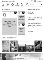
First up is the home screen. You now have the option of a more stylized home screen with book recommendation on the bottom, your most recently opened books in the upper left, and a list of reading lists on the right. The reading lists draws on your Amazon wishlist, as well as any list you may have created on Goodreads.
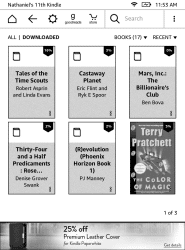
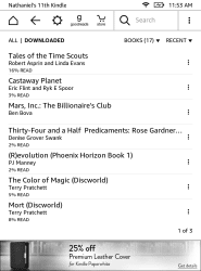
Here’s the new home screen option, along with the other two options:
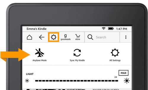
As you can see, the menu bar across the top has changed. It now features a quick action menu icon third from the left, and a search bar.
That quick action menu lets you adjust the frontlight, enable airplane mode, sync your Kindle, or open the settings menu:
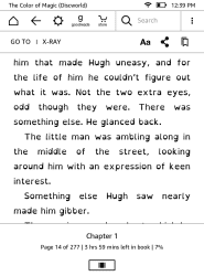
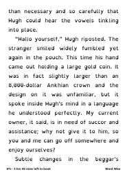
And last but not least, Amazon has also added a new dyslexic font as your 8th font choice.
This font is intended to help those with reading disabilities by emphasizing parts of each character and so make the characters easier to recognize. There is some dispute among experts whether this helps or not, but as you can see the font does look distinctive.
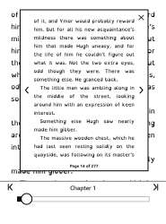
The menu inside the book looks a little different from before, and it also offers a new browse option I haven’t seen before. (Is it new? Edit: No.)
OverDrive offers a similar font in its reading app, and you can also download a open dyslexic font for free and use it with your preferred reading app.
The update can be found on the software update pages on the Amazon website.
image by gminguzzi

Comments
Name (Required) February 2, 2016 um 1:28 pm
Possible typo:
… and a lost of reading lists on the right.
Shouldn’t it be 'a list of reading lists'?
Frank February 2, 2016 um 1:32 pm
I like the new UI, it is nice to have a change after three years with the same UI. However, I don’t like the book recommendations on the bottom. In the old UI the recommendations could be turned off.
Julie February 2, 2016 um 1:34 pm
This upgrade is not available for the first generation Paperwhite.
Nate Hoffelder February 2, 2016 um 1:44 pm
@ Julie, Frank
Thanks for catching that. I thought I checked all three update pages, but I must have caught one of them twice.
Frank February 2, 2016 um 1:40 pm
I went to the software update page to check it out, and the first Paperwhite (2012) still has the update from about a year ago. The two most recent Paperwhites, Voyage and Kindle 7 have the 5.7.2 update.
Julie February 2, 2016 um 2:19 pm
@Frank You can turn off the recommendations but if you do it also turns off the reading lists option.
All Settings | Device Options |Personalize Your Kindle | Advanced Options | turn off Home Screen View
RK February 2, 2016 um 7:38 pm
Thanks for the heads-up on the updates. Looks good.
Mike Hall February 2, 2016 um 8:59 pm
Maybe I’m turning into a grumpy old man who doesn’t like changes but I’m perfectly happy with the current home page on my generation 7 Paperwhite and none of the features illustrated interest me. I just want a "clean" reading experience: recommendations are fine when I’m on Amazon’s website but I want to keep them there.
At least it seems that I can turn off Home Screen View (thanks for the information Julie) so I guess that I’ll still be able to just see a list of the collections on my home page pretty much as I do now? And as various people have pointed out our three generation 5 Paperwhites don’t get the update anyway.
Nate Hoffelder February 2, 2016 um 9:11 pm
Yes, as I showed in the first set of screenshots, you can stick with the list home screen.
Mike Hall February 2, 2016 um 9:26 pm
Thanks Nate. I should have looked at your illustrations more closely but I was distracted by looking at those on Amazon’s website (they sent me an email announcing the update with links to some "pretty" pictures). I’m now distracted by studying your choice of SF and wondering why you have so few books on your 11th Kindle.
I see that you didn’t lay out the extra cash to get rid of the adverts at the bottom of the screen. I bit the bullet and did so just to get on more title per page in the listings.
Nate Hoffelder February 2, 2016 um 9:42 pm
That’s easy. I don’t like reading on the Paperwhite. No page turn buttons.
Maybe I should have let the KPW also show the ebooks in my account, and not just on the ereader. Then you’d be really confused by all the romance novels my mother has in my account, LOL!
Steve H. February 2, 2016 um 10:09 pm
Helvetica seems to be sharper and with less visual weight…Kindle definitely needs a bold option.
Markierungen 02/03/2016 – Snippets February 2, 2016 um 11:31 pm
[…] Kindle Update v5.7.2 Adds Open Dyslexic Font, New Home Page (Screenshots) | The Digital Reader […]
Reader February 3, 2016 um 12:21 am
How do you reverse the update? I prefer the Helvetica font the way it used to be.
Mike Hall February 3, 2016 um 6:12 am
Nate: "Then you’d be really confused by all the romance novels my mother has in my account"
I’d have just assumed that you were one of the many male romance readers who can now indulge their habit in public without needing to hide their book covers! Mind you, as my wife and mother-in-law both share my account anyone looking at all my books in the cloud view would get an odd idea of my tastes.
As for page turn buttons, I have them on my old keyboard kindle and never missed them when I switched to a Paperwhite (at least once I realised it’s better to stroke the page rather than tap it). Comments on sites like this show that there is no kind of consensus as to what makes a good reader, other than a good screen. My 90 year old mother-in-law, for example, just wants something which is least likely to cause a problem if the wrong button is pressed: her Paperwhite is almost perfect (ideally I’d like to be able to disable the browser and a few other functions) but a tablet or phone would be a disaster. I much prefer the Paperwhite to tablet, phone or PC for fiction but switch to a 10″ Android tablet or even the PC for anything with illustrations. Others swear by their phones, which I never think to use to read.
Jason van Gumster February 3, 2016 um 10:27 am
It’s nice to see the inclusion of Open Dyslexic as a font option. Getting that font installed on Kindles is one of the reasons a lot of people I know ended up jailbreaking. Now they don’t have to… not for that reason at least.
Keith Beckman February 3, 2016 um 10:50 am
Do you have a source for the OpenDyslexic info? I’m not seeing that mentioned on the Amazon page.
Nate Hoffelder February 3, 2016 um 10:55 am
I saw the font when I opened the ebook. I took the screenshot myself.
Daily Links and Deals: Low-Income Americans Face Internet Access That Is Slow, at Risk of Disruption | The eBook Evangelist February 3, 2016 um 2:01 pm
[…] Kindle Update v5.7.2 Adds Open Dyslexic Font, New Home Page (Screenshots) (The Digital Reader) – Your Paperwhite and Voyage e-reader home screens are getting an update! […]
Rasputin February 3, 2016 um 4:22 pm
Did they add a bold font?
Nate Hoffelder February 3, 2016 um 5:04 pm
No, darnit.
Annoyed February 3, 2016 um 4:49 pm
I was unable to update manually and contacted Amazon support. They told me that the download will not work on PCs running Windows 10 and IE. They told me I would have to switch to Chrome to get the download. Two words: unacceptable and ridiculous
Nate Hoffelder February 3, 2016 um 4:51 pm
That sounds like an IE problem, not Amazon.
It’s also one I haven’t heard before.
annoyed February 3, 2016 um 10:11 pm
Please delete my earlier comment. I had another call with Amazon Support and all is now well. There is NOT a problem with Windows 10 and IE. The update worked and the device is good to go.
Nate Hoffelder February 3, 2016 um 11:02 pm
So just the usual download snafu? That happens.
Amazon Now Demanding That You Update Your (Very Old) Kindle | The Digital Reader February 10, 2016 um 11:50 am
[…] not to update their older Kindle models. For example, the most recent Kindle firmware update (v5.7.2) was only made available for the 2013 Kindle Paperwhite and the more recently released Kindle […]
Pocket v6.2 for the iPad Adds Dyslexic Font, Premium Options | The Digital Reader February 17, 2016 um 9:56 am
[…] the Open Dyslexic font which Amazon added to the Kindle only a few weeks ago, Dyslexie is designed to make it easier for readers with dyslexia to recognize […]
Jonikka February 28, 2016 um 11:26 am
How do you turn on the reading time after the update? I loved knowing how far into the book I was and whether I had enough time to finish a chapter, but this feature was lost in my update. Can someone let me know how to turn that back on?
greg March 2, 2016 um 9:29 am
Touch the lowest left corner of the screen, until you get the feature you like.
25 ideas for using mobile apps in library services – Nicole Hennig July 16, 2017 um 2:35 pm
[…] the Kindle app or the Overdrive app for readers with dyslexia. These apps offer the OpenDyslexic font. According to opendyslexic.org, the font helps dyslexic readers distinguish letters and words for […]