Why All Fonts Are Not Created Equal (video)


If you’d like to know why Kobo developed the Nickel font for its ereaders but isn’t using the font in its iOS apps, or why Google commissioned the Literata font, then I have a video for you to watch.
Yesterday I got into a discussion of fonts, and that inspired me to go dig up a video of one of the sessions at the eBookCraft conference held in Toronto in March. Steve Matteson, a type director at Monotype, gave a 29 minute history of fonts and typography from the Gutenberg press until today.
The first half of the video was kinda interesting, but the part you must see starts at about the 15 minute mark. Matteson explains how fonts used for printing differ from fonts used for LCD screens, and he explains why fonts are designed differently for E-ink screens.
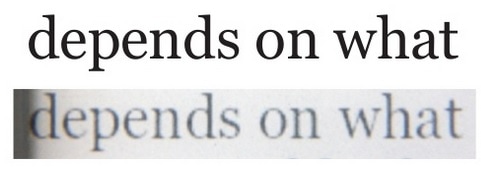
For example, one slide compares what a font is supposed to look like with what it actually looks like on an E-ink screen:
He then goes on to explain how a font is designed for specific screens (both LCD and E-ink) versus print, the impact of size on readability, and a bunch of other issues which will interest any reader of this blog.
I’ve embedded the video below, but before you watch it you should head on over to Slideshare and grab Matteson’s presentation. He illustrates his points in the slides, but not enough of the slides were inserted into the video. You’ll need to flip through them yourself.
FYI: slide 34 corresponds with the 14:55 mark.
P.S. You can find more videos from eBookCraft and from Tech Forum over on the BookNet website.


Comments
Reader May 21, 2015 um 10:54 am
The picture of the font, showing that a non-uniform letter "thickness" doesn’t look too good on an E-ink screen, may be the reason why I much prefer Helvetica font, which has letters of uniform "thickness."
William D. O’Neil May 21, 2015 um 6:14 pm
Thanks much. There’s a huge amount of nonsense about typefaces and it’s nice to hear from someone who is so knowledgeable and realistic.
Nate Hoffelder May 21, 2015 um 7:50 pm
Welcome. I found it informative when I saw the presentation in March, and I knew everyone would want to see it.
Name (required) May 31, 2015 um 6:39 am
Sadly, not everyone ;-).
The vast majority of people do not care. When I complain about crazy margins or low number of font sizes or lack of hyphenation on Kindle or other shortcomings of text-rendering on the vast majority of other readers they look at me funny. They have no idea what I am complaining about. Even large number of my fellow Mobilereaders do not care whether their text is with ragged right or flushed.
BTW, the video is great.
Kindle for iPad/iPhone v4.9 Adds Amazon's Bookerly Font, Better Kerning, Hyphenation | Ink, Bits, & Pixels May 27, 2015 um 8:50 am
[…] Steve Matteson explained in the video I posted last week, that is harder than it sounds. In order to get the best performance, fonts need to be customized for specific screen types (LCD […]
Zalina Alvi May 27, 2015 um 4:39 pm
Apologies for the lack of slides in the video. We had the wrong version uploaded. The correct one is now up, with all the slides. And the embedded video on this page should display the correct one automatically.
Thanks for sharing, Nate!