CreateSpace to Close its Web Store

Amazon’s POD service Createspace is going to shut down its eStore at the end of the month, and in the future will be directing all sales queries to Amazon.

Amazon should be sending an email to affected authors, and you can read the official notice on the Createspace website.

While this is certainly less hassle for Amazon, Chris McMullen notes authors are going to take a hit in the pocketbook. Createspace now pays an 80% royalty on copies sold through its site, but only 60% for copies sold through Amazon.com.

This means that any author with active direct print sales will make less per sale. On the other hand, Chris also noted how authors might benefit:

  • Some customers who would have visited your eStore, but who would not made a purchase through CreateSpace (because they didn’t qualify for free shipping, had to setup a new account with CreateSpace, or didn’t trust CreateSpace like they trust Amazon), might now make a purchase from Amazon. The redirection might help a little with a higher percentage of sales.
  • Some customers who would have purchased one book from your eStore might buy a few of your books on Amazon (because your Amazon page features your author page, or because your other books show up on your customers-also-bought list).
  • When a customer buys your book from Amazon.com after being redirected from your eStore, your Amazon.com sales rank will improve, whereas eStore sales had no effect on sales rank.
  • When a customer buys your book from Amazon.com after being redirected from your eStore, the customer’s review will be a Verified Purchase (except for the rare customer who chooses not to let this designation show), whereas reviews from eStore sales were unverified.

Amazon is also going to soften the blow by offering better selling authors an "adjusted" royalty rate. Starting on 1 November, for the next six months Amazon will pay authors a royalty rate based on the ratio of past POD sales an author made through the Createspace eStore versus POD sales made on Amazon.com.

More sales in the eStore means a higher royalty – for the next 6 months. After that it is catch as catch can.

The Publishing Industry Thinks Facebook and Netflix Are Doomed

The legacy publishing industry keeps bleating about "screen fatigue" as the cause of why people are buying fewer of their ebooks (because it could not possibly be that Big 5 ebooks cost too much, oh no).

Industry accomplices in the press are more than willing to repeat this claim without question, which is a pity because it doesn’t even pass the sniff test. It’s not just that the industry has never shown any evidence, but also that larger trends in online behavior do not support that claim, either.

I was reminded of this when I read this morning’s Shelf Awareness newsletter. They had someone at yesterday’s CEO Talk at the Frankfurt Book Fair, recording the various claims made by  S&S CEO Carolyn Reidy.

From beginning to end, the piece is nothing more than a record of the industry telling itself the emperor is wearing clothes, but this part in particular caught my eye.

Noting that it’s been 10 years since the mainstream adoption of e-books began, Reidy and Dervieux talked about why they think the dire predictions of the death of print have not come to pass. Reidy proposed that while nothing "went wrong" with e-books to cause the leveling-off of their popularity, consumers most likely simply "got tired of screens." She noted that for years before e-books, publishers had been "taking pennies out of the cost of making a book," but when digital became widespread, publishers began "spending years putting value back into the book." Dervieux wondered if perhaps the industry expected "too much, too soon," from the e-book format, and remarked that even by the "grace of Jeff Bezos and huge discounts," such a large shift in consumer habits could not happen in such a hurry.

Reidy added that she believes "very firmly" that a new version of the book based on digital delivery will come eventually, though she does not know what it might look like. "Some person who is young and grew up with the screen will come up with something that I hope we recognize," she continued. "There will be a new form of it, because there has to be."

Yeah, we’ve been hearing that bit about screen fatigue for what, a couple years now?

While it sounds plausible and it is a great distraction from  the fact that high ebook prices are negatively impacting sales, the simple truth is that it is utter bunk.

If screen fatigue were a real thing then you would already be reading stories about people using Facebook less. If it were real then there would be headline stories about Nielsen data showing people are spending less time online (they’re not).

If this were a real thing then a Google search for "people spend less time online" would turn up a hundred stories on the trend (it doesn’t).

I could go on, but do I really need to keep finding zero evidence to back up this claim?

If you have any, I would love to see it.

And it had better be good, because there is also a fundamental flaw with the current discussion of screen fatigue: The term describes a decline in an activity (use of screens) and it is being used to explain away a drop in commercial sales.

It goes without saying that there is no direct connection between the buying ebooks and using a screen any more than a decline in DVD sales would automatically mean people are watching fewer movies on their TVs.

You’re welcome to make the argument, but good luck with that.

image by Johan Larsson

New Kindle Oasis is Waterproof, Costs $249, and Has a 7″ Screen

Amazon has replaced its least satisfactory and highest priced Kindle today after a brief 18 months on the market.

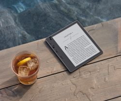
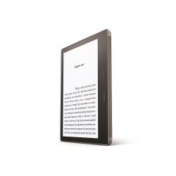
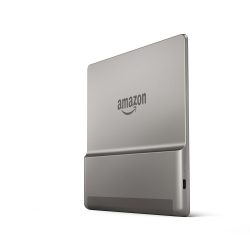
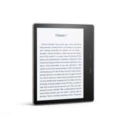
The new Kindle Oasis looks a lot like the earlier model, only it is waterproof and will cost $249 when it ships on 31 October.

And oh yes, the new Oasis has a 7″, 300 ppi E-ink screen.


Amazon’s newest Kindle has what Amazon is now calling a 7″ Paperwhite display. It has a frontlight and touchscreen, and a screen resolution of 1680 x 1264.

Edit: found it.

Amazon never got back to me on the screen resolution before this posted, so I’m not sure what it is – I’m not even sure if that is a 7″ screen and not an improved 6.8″ screen  similar to the one Kobo uses on the Aura H2O. (We’ll have to look into this later in the day.)

At 194 grams, the new Oasis is bigger than its predecessor, and also comes with more storage – 8GB or 32GB – but it still has the same lopsided one-handed design.

Don’t get me wrong, I like one-handed ereaders – it’s just that with the first Oasis, Amazon got cute by dividing the battery between the case and the ereader, forcing you to choose between either a lightweight device with disappointing battery life or a heavy one with adequate battery life. Not only did this take all the fun out of the design, faulty connections between the Oasis and its case resulted in several early reports of battery issues.

Fortunately, Amazon fixed that problem with the new Oasis model, putting the battery inside the Oasis, giving it an acceptable life measuring in weeks. And according to Amazon, it’s IPX8 rated to protect against immersion in up to two meters of fresh water for up to 60 minutes.

According to the press release, the new Oasis does not have a battery case, and that’s great news.

What’s also great news is that the new Oasis has Bluetooth (and Wifi, obviously). And to answer your next question, yes, you can pair the new Oasis with a BT speaker and play audiobooks. The previous model had audio, but only for its accessibility feature – and that required a USB dongle.

The new Oasis is better in every way, and that includes the software. According to the press release, the Oasis has 5 levels of boldness as well an option to invert the screen colors to give you white text on a black screen. You will also be able to increase the size of items like the text on the home screen and library as well as the book icons.

Between one thing and the other, the new software features are going to make the Kindle a heck of a lot nicer for those with vision impairment.

Amazon has given us many reasons to buy the new Oasis, but if you have an older Kindle, you’re in luck: they’re getting the new software features in an update which comes out today.

The listing for the new Kindle Oasis should be live by the time you read this post.

Amazon

New Tolino Epic is Water-Resistant and a Plus-Sized Screen

Today is proving to be the day of the large-screen ereaders. Not to be outdone by the Kindle Oasis leak, Tolino just announced its newest and largest ereader.

The Epic (or Epos, which is the name in German) has a 7.8″ screen like the one on the Aura One, and it is waterproof.

The Epic has a screen resolution of 1872 x 1404, and it has both a touchscreen as well as a frontlight. It ships with 8GB of storage, Wifi, and a 1.2 Ah battery which provides up to 4 weeks of battery life.

Curiously, it does not have the color shifting frontlight pioneered by Kobo (given that Rakuten is now Tolino’s tech partner, I was expecting that).

Edit: Actually, it does have a blue light filter (just like the Tolino Vision 4HD). It’s just that Tolino screwed up the description badly, telling us that it can go “from cold white light in the morning to warm white light in the evening”.

Weighing in at 260 grams, the Epic runs Android 4.4 on a 1GHz Freescale CPU with 512MB RAM. Those electronic guts are protected by an HZO coating which Tolino has promised will keep the Epic safe for up to 30 minutes underwater.

And to be clear, the device is named the Epos, not the Epic. That was a bad decision on the part of Tolino because the first thing that springs to mind when I see the word EPOS is that it is an acronym for "electronic piece of s***".

It does not deserve the label, but that is what comes to mind.

Heise

How to Save $39,000 When Choosing a Domain Name for Your Author Website

It is a truth universally acknowledged that an author in possession of a book must be in want of a website. They need a home on the web to call their own, one safe from the fickle whims of Facebook’s algorithms.

That home will need a name – but what to call it?

Like the Chinese word for crisis which is erroneously described as consisting of the words “danger” and “opportunity”, choosing the domain for an author website comes with both great risks and high potential rewards. It is a way for authors to brand themselves online.

So what are your options?

Some authors choose to go with the perfunctory choice, but others choose a domain of a more personal nature, or a whimsical one.

The Mundane

Well, you could go for the obvious and staid choice such as the author’s name, book series, character name, or book title. Those options usually work well – the author name is a great default that brings all (most) of an author’s work together on a single site (but it might exclude pen names), while naming the site after the book series or main character might add a small boost to SEO.

Edit: Some will insist this is the only way to go because if the author’s name isn’t in the domain then it won’t be found in search results. This is simply not true; the right SEO will make sure that a search on an author’s name will lead to their site.

I named my blog The Digital Reader because it referenced the topic I wanted to cover: digital reading, in its many forms. It is a decent choice, but it is not without its problems. For a number of years people kept confusing me with a competitor who has a similar first name and blog name. (If I had realized that would be an issue, I’d have chosen a different name.) Also, I never did get the domain I wanted – I had to go with the-digital-reader.com because domain squatters were demanding exorbitant fees for the domains DigitalReader.com and TheDigitalReader.com.

One of the domains would have cost me eight grand, and the other is listed at $39,000. (In fact, I just got an email asking me if I were interested in the domain, hence this post).

I feel paying $39,000 for the domain would be a huge waste of money, which is why I have never gotten those domains. A lot of web people agree with me, but if your favorite domain has already been registered, and you can get it for a fair price, you might want to spend the money.

The Topical

If you don’t want an obvious title, you could go for a more topical title. Rather than use a domain that explicitly references an author’s work, the author might choose a domain that is in some oblique way connected to the work.

For example, when I considered launching a site that reviewed the Chinese takeout places in my area, a friend recommended that I use the name TheOysterPail.com. This domain references a little known fact that the little white boxes that Chinese food comes in were originally created to hold shucked oysters, and were called Oyster Pails.

I ended up using the domain for my humor blog after I was told that NO, I could not buy and review that much Chinese food.

Speaking of that humor blog, did you hear about McDonald’s buying the domain EIE.io?

Another way to come up with a topical title is to use the “And Method”. This is a trick for coming up with unique names where you combine two otherwise unrelated words, and in this situation an author might choose two words that hint at their work.

Swords & Sorcery, to name one obvious example, suggests a D&D-style fantasy, while Coffee and Corpses hints at police procedural, or detective stories. And then there is Death and Texas, which is both clever word play and possibly a topical reference to for author whose mystery novels are set in Texas.

The Whimsical

But you don’t have to go for the topical or staid choice; you might instead go for the whimsical or the personal.

When it comes to the personal, you might use your online handle as your domain name – a suggestion I have made to a number of Twitter users. The benefit here is that you get to build your author identity on top of your established online identity, giving readers a feel for the person behind the name.

Edit: Chris Meadows mentioned in the comments that Googlewhacking might be useful here. This was a game where you try to find a pair of words that gets only one a single Google hit. if you can find that pair of words, it would make for a unique domain name.

Edit: Over at The Passive Voice, PG writes that he has found a site called Nameboy helpful for locating good domain names.

On Nameboy, you type in a primary word and, optionally, a secondary word. Thereafter Nameboy generates all sorts of possible domain names based on those words. It lists them in a table that shows you which of its generated site titles are available as domain names and which are not.

Or, you might choose a name that references the work of your favorite author – for example, borogroves hints at Lewis Carroll – or you could come up with a whimsical name by combining random elements. For example, 3 Pugs and an Octopus is both unique and funny enough that it begs for people to ask about the story behind the name.

Any name that inspires questions is a great name because it is a conversation starter, and I can confirm that from personal experience.

I can’t tell you how many times I have been asked about the name Valiant Chicken, my WordPress business. As I explained in a blog post last year, I thought up the name while inventing new variations on the porn star name game.

I tell people that their first tech company should be named after their middle school name and their last meal, and that their Batman villain name is their profession plus the color of their socks, and use that spiel to establish a memorable first impression as a creative professional.

Edit: It took me three years to figure it out, but that was actually terrible advice. I should have listened to the people who told me to change the name.

I have been told that I should get rid of the Valiant Chicken name because it has no connection to WordPress services. Authors will receive similar advice that they should choose a domain that brands them as an author, and that advice is just as bad for authors as it was for me.

The sky is literally the limit.

Amazon Not Closing All Its Support Forums

When I reported my scoop last week that Amazon was closing its support forums, it looked like Amazon was going to simply abandon its customers to go find support on social networks and third-party sites.

It turns out that is not the case. Ongoing discussions on MobileRead Forums have turned up an interesting detail: Amazon has recently launched a new support forum.

The Kindle Help forum, which is apparently an entirely different forum from the Kindle forum, is going to remain open.

We are always looking for new ways to make it easier for our customers to find answers to their Amazon product questions. Starting the morning of October 9th , Pacific Standard Time, we will be introducing an improved forum experience, with expanded digital and devices help forum categories. With this update, customers will now have more choices, the opportunity to post rich content (like photos and videos), and view and post from their mobile devices.

We look forward to your feedback on the new forums!

If you didn’t realize there were two similar forums on Amazon, you’re not alone. I didn’t know, and Amazon sure as heck made it impossible to find the forums.

Going by the dates on discussion threads,  the Kindle Help forum is brand spanking new. Amazon opened the new forum the middle of last month, and has spent the last few weeks working the bugs out.

Edit: Readers have corrected me on the point of when Amazon launched this forum. They say it is at least several years old.

So what we really have here is that Amazon launched a new forum platform, retired the old forum platform, and then screwed up the announcement explaining the changeover.

They’re not closing their support forums so much as replacing the old forum with a new one.

That’s what they should have told everyone, but did not, and that lead to chaos, panic, disorder, and blood raining from the skies.

What a mess – and also a surprise, given that Amazon is usually better at communicating.

image by rich701

Author Website Checklist

No two author websites look the same, but they all share a few common characteristics. Generally, author websites have to fill four needs. An author site needs to tell visitors:

  • what an author has written,
  • who the author is,
  • how to contact the author, and
  • what the author is writing next.

Before you launch your author site, here’s a quick checklist to make sure you have all the parts you need.

  1. Author bio – Have you posted a bio on your site, and does it include a photo? Readers want to know more about you, which is why you should post a bio on your site. You should include a photo as well as details about how you got into writing, what you do for fun, and other personal info.
  2. Books – People can’t become your fans if they don’t know about your books, and if you don’t list your books on your site they will never find out That’s why you should create a listing page for each of your books, and while you’re at it  a directory page and series summary.
  3. Mailing list – Your fans will want to hear from you when your next book is out, so you should give them the chance to sign up for your mailing list. Don’t forget to offer a freebie to anyone who signs up.
  4. Contact page – People need to be able to reach you so organizers can invite you to events, fans tell you they love your books,  and bloggers can ask about ARCs. That’s why you should have a contact page with a contact form and your email address.
  5. Social media – Have you added links to all your social media accounts? (It’s okay if you don’t have any, but you should link to the ones you do have.)
  6. Events – Have you added a calendar or some other way for fans to know when and where they can meet you?
  7. Home page – Your home page is the first thing new visitors will see, and you never get a second chance to make a first impression. That’s why your home page should tell visitors who you are, and include either a call to action or the cover of your most recent book (or both).

You don’t need to check off all the items on this list, although it would be a good idea to include all the details you think will be useful or important to your site’s visitors.

image by Amy Guth

Confirmed: Amazon to Close its Support Forums on Friday

This blogger is still awaiting official confirmation, but it appears that Amazon is shutting down its customer forums.

There are multiple reports on Amazon’s forums that Amazon has posted a banner which read:

The Amazon forums are retiring October 6, 2017. Amazon would like to thank the members of this community for contributing to the discussion forums. As we grow and evolve, we encourage you to explore Goodreads Groups for books and Spark for other ways to engage with your interests.

I have not seen that banner myself, and Amazon PR has not yet confirmed the news, so at this point we don’t really know what is going on.

Update: It’s official. Amazon is closing the forums on 13 October, next Friday.

Second Update: Or not. What Amazon didn’t tell us was that they recently opened a new support forum which is going to replace the old.

If Amazon does follow through and kill its forums, it will b a loss to the local community but not a huge surprise.

The real question isn’t why Amazon would do that but why not. The forums were never closely integrated with Amazon’s site (I always had to Google for Amazon support forums in order to find them). Also, Amazon may have provided a space for its customers to congregate, but I can’t recall the last time I saw one of its customer service reps answer questions there.

Since the forums serve no clear purpose, why would Amazon keep them open?

image by dclay


People Are Weird About Books, and Attempts to "Improve" or "Fix" Books in a Web Browser Prove it

The first thing thing you should know about reading books in a web browser is that far more developers than users are excited about the idea of making a digital book look just like a print book.

I was reminded of this last night when I read about yet another startup that had rediscovered making stories read in a web browser look more book-like.

From FastCo:

Books in their current form are thousands of years old, dating back to the Roman Empire. And even today’s e-books preserve the visual cues of their traditional analog counterparts, with tables of contents, page numbers, and the affordance of “turning the page” by swiping. Reading in your browser, however, has retained little of the charm of reading a book, digital or real.

Now, the New York-based design studio HAWRAF is bringing some of those visual cues to a new digital book platform. In essence, it’s a browser-based e-book. Designed specifically for a new online book called Poetic Computation: Reader by Taeyoon Choi, the platform lets users play around with font, text size, line spacing, and background color. When you click on the footnotes, located in tiny typography to the right of the main text, they overtake the main text so you can get a closer look. Meanwhile, anything you highlight can be exported as a PDF, letting you turn the most relevant parts of the book into a printable file. A “focus mode” blacks out most of the browser, keeping your wandering eyes from getting distracted. It’s the best aspects of reading online, combined with those of an actual book.

The second thing you should know about reading books in a web browser is that it’s not exactly a new concept.

Fifty-eleven different developers have executed this idea over the past couple decades. This includes Amazon, Barnes & Noble, and Kobo, each of which have released a browser-based reader, Ibis Reader, a few dozen independent developers who released browser extensions, and Safari Books Online, which has been serving up nonfiction books in a web browser since forever.

It’s an old idea, and for the most part it hasn’t gone anywhere. Two of the The three ebook retailers have shut down their web apps, most of the independent developers have moved on to other projects, and just about the only project that persisted is Safari Books Online – and that stuck around largely because that browser app is the core of their subscription service.

The thing is, readers are indifferent to the idea reading books in a web browser.

Or to be more exact, readers are ambivalent to the obsession that some have with making books in a web browser look exactly like those books would look on paper.

And yes, this focus on vestigial aspects of paper books is an obsession – and a strange one, when you really sit back and think about it.

People spend inordinate amounts of time reading in web browsers, and yet no one insists that Wikipedia would be better if it were formatted like an encyclopedia, no one wants The Atlantic to look more like a magazine, and no one insists news sites should look more like newspapers.

Instead, the trend for web content leans to a clean single column layout (think Instapaper, or Google AMP).

It is only with books that the crazy people start coming out of the woodwork, insisting that the digital books in a web browser have to ape unimportant characteristics of print books.

I have said it before, but it bears repeating.

People are weird about books.

AAP Reports Hell Hath Frozen Over: Publisher eBook Revenue Up in May 2017

I hope you’re sitting down, because the latest month Statshot report from the Association of American Publishers is so surprising that it could knock you off your feet.

The AAP revealed on Thursday that publisher ebook revenue was up 2.4% for the month of May.  eBook revenues were still down 3.3% for the year, however, making the new stat more of a quirk or anomaly rather than the beginning of a trend.

Revenues from sales of hardback books and audiobooks were also up in the first five months of the year (6,7%, 32.5%) while paperback sales dropped 3.9%.

In terms of categories, YA revenues were effectively flat while adult revenues increased 1.6% and revenues at religious presses increased 4.1%.

total trade revenues increased 1.4%, to $2.6 billion, in the first five months of the year.

Press release:

Book revenues for trade book publishers were up 2.4% in May 2017. The growth was attributed to increased eBook sales for Adult Books, up 3.4% over May 2016. This is the first monthly increase over prior year sales since March 2015, according to the StatShot Monthly report from the Association of American Publishers (AAP).

The increase in eBook sales was one element of a growth month for book publishers. Revenues for book publishers were up by $50.7 million (4.6%) in May 2017 over May 2016. Revenues from Jan. – May 2017 were $4.25 billion, gaining $175.7 million (4.3%) compared to the same timeframe in 2016.

With the exception of Professional Books, all reported categories saw sales increases for the month. The categories with the greatest growth in May were Childrens & Young Adult Books (11.8%) and University Presses (7.3%). With these and other gains, no categories are reporting revenue loss year-to-date.

StatShot tracks publisher revenue on a monthly basis for about 1,200 publishers of trade (fiction/non-fiction/religious), PreK-12 instructional materials, higher education course materials, university presses and professional books.

Trade Books

Revenue for Trade Books was up 5.0% in May 2017 compared to last May, with gains in Adult Books, Childrens/YA Books and Religious Presses. For the year-to-date vs the same time in 2016, revenues for trade books increased by $36 million (1.4%) to reach $2.64 billion.

Total Trade Net Revenue by Category (in millions)*

Jan. – May 2017 Jan. – May 2016 Percent Change
Adult Fiction/Non-Fiction

$1,806.9

$1,778.0

+1.6%

Children’s/YA

$670.5

$670.2

0.0%

Religious Presses

$165.5

$159.0

+4.1%

Total Trade

$2,642.9

$2,607.2

+1.4%

Trade Book Formats

Downloaded audio had another strong month, up 43.4% in May 2017 vs. May 2016 and 32.5% from Jan. – May 2017 vs. the same five months in 2016. Revenue for print books was also up this May, with growth in hardback, paperback, mass market and board books. Year-to-date, hardback and board books had revenue gains. While eBooks saw growth in May, the overall format remains down year-to-date.

Total Trade Net Revenue by Format (in millions)*

Jan. – May 2017 Jan. – May 2016 Percent Change
eBooks

$466.1

$482.1

-3.3%

Hardback

$901.9

$845.1

+6.7%

Paperback & Mass Market

$1,008.3

$1,049.7

-3.9%

Downloaded Audio

$129.9

$98.1

+32.5%

Other (physical audio, board book)

$136.7

$132.3

+3.3%

Education and Scholarly Publishing

Higher Education and PreK-12 publishers saw revenue growth during May, up 3.1% and 5.5% respectively compared to the prior year. Revenue in both categories was also up year-to-date, growing 22.6% and 1.8% respectively.

Professional Books was the only category to see a decline in May, down 1.9% compared to May 2016. However, year-to-date revenues remain up by 2.7%. University Press revenues were up 0.9% compared to the first five months of 2016.

Note: * All figures represent publishers’ net revenue from all distribution channels (these are not retailer/consumer sales figures).

image by pedrik

Author Blogging 102: a Practical Guide to Developing Your Weekly or Monthly Link Post


Content curation (or as I prefer to call it, "link posts") is a great way for authors to help both their readers and other writers by one, pointing readers articles worth reading, and two, giving other writers public kudos by including their work in a post.

But if you’ve never created a link post before, it can be difficult to tell where to begin. I can help with that.

This post boils down my experience with curating link posts and lays out a practical step-by-step guide that you can use to both develop your link post and to set up the procedures you will need to consistently publish your link post on a regular schedule.

Link Posts on My Blog

I have been curating a daily link post on and off since since 2010, and in that time I have also published other bloggers' weekly and monthly link posts. Currently I am publishing my own Morning Coffee link post as well as Paul Biba’s weekly link roundup (from his Twitter feed). Both are posted on The Digital Reader. I also curate the weekly ebook link post for MediaShift, and am in the process of developing a link post for the EPUBSecrets blog.

I’ve been doing this so long that I have developed hard and fast rules on what should and should not be included. Here are my guidelines for curating a link post.

  1. Read everything you include in the link post. You don’t want to link to a piece which is nothing more than a snippet with link, or is itself a link post. You should also avoid posts where the blogger got their facts wrong, or where the blogger wandered off-topic (unless the diversion is entertaining).
  2. Do not include your own work – unless you are directly responding or rebutting to one of the other links. Remember, the value of content curation is in helping readers find new content, not your own.
  3. Set a schedule, and keep to it. If you can only commit to once a month or every other week, that’s fine.
  4. Keep it short. No one wants to read a link post with 30 links; readers' eyes will glaze over by the tenth link, or they will be interrupted, or they’ll simply be overwhelmed. Try to aim for links to six to ten stories.

I will be honest with you – I break these rules all the time. But I do try to follow them (especially the first two) because I have found, as a reader, link posts that consistently ignore the first two rules have little value to me as a reader.

Keep these rules in mind as you develop your link post and readers will appreciate your curation efforts more.

Readers will also appreciate your work more if you put time into developing your own procedures before publishing the first link post, and I can help you with that. Over the past 8 years I have developed a number of guidelines or best practices and I have refined my techniques to the point that I can get a link post done in under half an hour (longer if I stop to read everything before rather than after completing the link post).

I have boiled down setting up a link post (or newsletter) to five key components.

  • Sources
  • Topic
  • Timing
  • Format
  • Graphics

Sources

The first thing we have to do is shoot all the lawyers – er, find stories to link to. Here are some of the tools I use to find stories.They are all free, too.

  • Twitter – Facebook is where people go to hang out, but Twitter is where you will find the news junkies. We not only tweet links that you can find through twitter search, but we also collate lists of sources. I myself have created four lists of Twitter users who share a lot of links, and I follow a half-dozen lists made by others.
  • Google News , Bing News – Just put in your favorite keywords, and these two niche search engines will give you an endless, constantly updated stream of news stories. Based on different algorithms, Google News and Bing News will give you different results, but they do share one deficiency – they’re biased towards a strict definition of "news", which means they will miss a lot of the more interesting blog posts and other commentary.
  • Feedly – Here’s an old-school solution for you. Way back in the time before people shared lots of links on Twitter (about six years ago) news junkies used to have to subscribe to news sites and blogs, and then periodically check to see if those sites had published new articles. We used services like Feedly to stay on top of all those subscriptions.
  • Google Alerts – do you know what’s even better than looking for news? Having it come to you automatically. Google Alerts lets you follow search results for just about any search term. Whenever a new result is found by Google’s bots, you’ll get an email with the news.

Topic

It’s hard to say how you should pick a topic, but I do have a few ideas.

An author might find that their readers are interested in topics related to the author’s work. Fantasy readers might like links to articles about armor and archaic weapons, or historical trivia. SF readers might want to read about the latest theories in faster than light travel, or other new technologies.

What catches your attention? What do you think your readers will be interested in?

And is anyone else focusing on that topic for their newsletter or link post? (You don’t want to copy someone else’s idea and come out looking second rate – or worse, a plagiarist.)

Timing

Do you want to publish your link post once a week, everyday, or once a month?

The answer to that question really depends on how much time you can devote to this project, and how many linkworthy stories you can find. But what matters more than how frequently you publish is that you set a schedule, and pick the optimum time. MailChimp and other newsletter services will tell you that timing matters. Publish a post when everyone is busy and readers are more likely to simply skip it and get back to what they are doing.

They are correct, but alas, I can’t answer this one for you; the optimal time will depend on your readers. (Although, if you do decide to publish the link post a newsletter, MailChimp can recommend a publication time.)

Format

Before you publish your first set of links you will need to make three decisions about the formatting. Obviously you will need a title, and you will also need to write a one- or two-sentence intro for your link post.

But the big question here is how you want to organize the links.

Do you simply want to share a list of links, or do you want to include an excerpt from each story? Or do you want to instead write a one- or two-sentence description for each piece you link to?

There’s no single best option. I like to use article titles, but Joel Friedlander and many other bloggers use excerpts. Both work, but speaking as a reader I have also found that I am most likely to click a link in a link post if the curator wrote that one-sentence summary.

As the curator, the decision is up to you.

Graphics

It is always a good idea to include an image related to your topic or to one or more of the linked articles. It’s not just that it makes your link post look better but also that the right image will help your post get more attention when people share your post on Twitter or Facebook.

I make a point of using a photo of a coffee cup with my Morning Coffee posts because of how it ties into the title, but I also sometimes find an image that I want to share as one of the links (this drawing of owls on coffee, for example).

Another option would be to use the same image for every link post. I got this idea from MediaShift, where they have specific images for each of their daily link posts and for their once-a-week link posts.

Their images include the title of the link post on a background that conveys the topic. Here’s one example:

You can find an image on Flickr or a free image site (just make sure you comply with the license), and then you can go to Fiverr to find an artist to add text to the image.

I paid ten dollars to get text added to this photo:

In the interest of self-flagellation, I think the font choice could be better, but all in all that image works.

O O O

So there you have it; a practical step-by-step guide you can use to take your link post from idea to reality.

Link posts have been one of the more popular features on my blog over the years, and when done right they can generate a lot of traffic, help other bloggers gain recognition, and help readers stay up to date with the most important stories.

If you add them to your blogging routine I am sure your readers will like them as much as mine do.

image by ThoroughlyReviewed via Flickr

The Progress Technologies eOneBook is a Dual-Screen Manga eReader

Japan’s Progress technologies has an answer for those who say that digital comics are ruining the comic book experience. This company has launched a crowd-funding campaign for a dual-screen manga reader called the eOneBook.

The eOneBook features a pair of 7.55″ E-ink screens (300 PPI) in a case designed to look and feel like a paperback manga. Powered by AAA batteries, the eOneBook will have a paper edge (just like a real book) and page turn buttons.

It’s scheduled to ship in April 2018, and you can pre-order it today for 28,000 yen, but I’m not sure how many will be interested.

While the hardware specs are amazing enough to get me to pull out my credit card, the content limitation have made me put it away again.

The thing about the eOneBook is that it is going to ship with a single Manga series (Fist of the North Star). Both the Japanese and English language versions of the manga will come pre-loaded on the eOneBook, and that is all it will have.

According to the listing on Kickstarter, the eOneBook cannot be updated or changed. You can read this one series, but you won’t be able to load anything else.

While I am sure hackers will probably bypass that limitation, is it really worth paying $250 for a single-title ereader?

That strikes me as the worst of both worlds, but it looks like few share my opinion. The campaign has already been (over-) funded by a factor of five.

Kickstarter


The Dasung Paperlike Pro E-ink Monitor is What Every Author Needs

Stare at a computer screen everyday for years on end and eventually you’re going to develop vision problems. It might be headaches, or simply an inability to keep both eyes in focus.

That is exactly what happened to me, and I consider myself fortunate that my vision problems only took a turn for the worse after I met Dasung’s E-ink monitors.

Paperlike is a line of monitors based around a 13.3″ E-ink screen. The first model came out in 2015, and (to be frank) was crap. The drivers weren’t finished and didn’t work, and a lot of buyers reported that their units died in just a few months.

The second-gen Paperlike came out last year, and it was pretty good. It was still slow (and hella expensive) but it could be used for basic activities like typing.

The third-gen model, the Paperlike Pro, came out this summer. It’s still expensive but Dasung finally got the hardware and drivers right, and I feel I can finally say this is the one you should buy.

In fact, I am writing this review on the Paperlike.

For the record: I bought an original Paperlike with my own money. Dasung gave me the two later models. (Nevertheless, I still think the second-gen model is only worth using if you are absolutely desperate).

Pro & Con

Pro

  • non backlight/frontlight means no eyestrain
  • HDMI cable (the Pro works out of the box with any computer that has a compatible port – or even an iPhone)
  • Works great for typing, some types of web browsing, email, etc

Con

  • expensive ($800 on Indiegogo)
  • drivers still required for best performance
  • it takes a lot of software tweaks to really make web browsing worthwhile
  • did I mention it was expensive?
  • it gets a signal through HDMI, but still needs a USB cable for power
  • it still can’t do video
  • ships with a crappy stand (you should really invest in a monitor arm)

Hardware

The Dasung Paperlike Pro features a 13.3″ E-ink display with a screen resolution of 1600×1200. With a 150 PPI, it is a relatively low resolution screen compared to the Kindle Paperwhite (or a lot of smartphones) but it is still sharper than the screen on a lot of laptops.

The Pro, is designed to work as a secondary (or even primary) display for your computer, which is why it lacks a CPU, or any type of input. It is strictly a display, and it fills that role well.

It has exactly three buttons on the front: screen refresh, power, and "M" (for changing the display mode).

I have had one for about two months now. At first I just fiddled around with it, but for the past month or so I have been using it just about every work day. I installed my Pro on a monitor arm, and whenever I need to do a lot of typing, or whenever I feel my eyes are getting tired, I swing the Pro in front of my laptop’s screen.

I am typing this post on the Pro right now, and I type a lot of posts using this monitor. It is a permanent addition to my workspace, so much so that I am planning how I might take it with me on trips.

I m so committed to the Pro that I even spent time finding the best software tweaks to get the most out of it.

Software

The Paperlike Pro runs off paired HDMI and USB cables, so it is (mostly)  plug-and-play e-ink monitor.

I qualify that statement because if you don’t install the drivers (and run them every time you use the Pro), a nag screen will pop up every few minutes, telling you that your Paperlike Pro is going to explode into a million pieces.

But even when you do install the drivers, you will only be using about 60% of the Paperlike Pro’s full abilities; if you want to get the rest of the way there you will need to learn the software settings and how to optimize apps so they work well on the Paperlike Pro.

The Paperlike Pro has 3 display modes (A2, A16, and Floyd) and natively supports two screen resolutions (1600 x 1200 and 800 x 600). It can also be set to "mirror" one of your existing monitors, and duplicate what is shown on the first screen.

My preferred choice is to use the Floyd display mode and set the Paperlike Pro as a mirrored monitor because it is the easiest to use. Yes, I am missing out on the full 1600 x 1200 pixels, but I am okay with that.

I did try using the Paperlike Pro as a second monitor, but I found that the different screen resolutions meant I had to keep adjusting font sizes every time I switched between the Pro and my laptop. It was just too much of a bother given that I had to go back and forth every few minutes (I like using the Paperlike Pro, but its grayscale screen misses a lot of nuance).

Here are a few details about the display modes:

  • A2 – This mode shows only black and white. It is by far the fastest but it also loses a lot of detail.
  • A16 – This mode lets you use the same 16 shades of gray offered by ereaders. It offers the highest degree of detail but it is also as slow as the Kindle (which means it’s a poor choice for things like web browsing).
  • Floyd – A "sloppy but fast" mode based on the Floyd-Warshall algorithm, it trades accuracy and clarity for speed.

Floyd is the display mode I use the most. It has its issues (sometimes I have to refresh the screen so I can see what I am looking at) but this is the mode that really makes the Paperlike Pro usable. It’s a feature competitors will have to copy or duplicate should they release an E-ink monitor.

Really, though, the 3 display modes are just the beginning; to get the most out of this monitor you’ll need to tweak the settings and learn how to tweak apps so they play nice with E-ink screens.

The Paperlike Pro settings menu lets you change display modes, micro-manage the contrast, and there’s also an option to change from your computer’s native color theme to a gray or white option. (You _will_ want to use one or the other option, trust me; they make tabs on Chrome actually legible on the Paperlike Pro’s screen.)

You should also look into how you can get apps to look their best on E-ink. Chrome, for example, has a high-contrast extension that effectively changes everything to grayscale. That extension  makes twitter and other websites actually usable on the Paperlike Pro, and without that extension the web browsing experience is just frustrating enough that I would have given up on the idea.

And that, in a nutshell, is the experience of using the Paperlike Pro.

My Take

There are some products like the Kindle Paperlike that are finished consumer products that work just awesomely out of the box.

But then there are other products, like the original Kindle, which benefit from learning just a few subtle tricks and tweaks in a beginner’s guide.

The Paperlike Pro definitely falls in the latter category. There’s a half-dozen small things you can do, and effectively double its usability with each one.

Install the drivers? 2x

Learn how to use them? 2x

Tweak apps to play nice? 2x

I am not pointing all this out to complain about the Paperlike Pro; I think the extra work is worth it.

What I am trying to say is that anyone who doesn’t want to put in the extra work will not get the most out of this expensive device, and shouldn’t buy one.

Caveat emptor.

The Paperlike Pro can be bought for $800 on Indiegogo.

Specs

  • Screen: 13.3″ Carta E-ink
  • Touchscreen: none
  • Frontlight: none
  • CPU: none
  • Screen resolution: 1600 x 1200, 800 x 600, can also match your other monitor
  • Connctivity: HDMI, USB


It looks Like B&N Has Thrown in the Towel on the Nook

Len Riggio has just dashed the hopes of everyone who had been praying for a Nook turnaround.

According to Publishers Weekly, Riggio told the attendees at the B&N annual meting that the retailer fully recognizes its failures as a tech company.

Riggio also assured shareholders that B&N is no longer in the tech business. While the Nook e-reader and e-books will remain a part of the company’s offerings to customers, bricks and mortar stores will be its focus. Riggio explained that when e-book sales began exploding several years ago, B&N felt it had no choice but to enter the digital market. In retrospect, Riggio said, B&N didn’t have the culture or financing to compete with the likes of Amazon and Google.

Instead, according to Riggio, B&N will focus on its physical stores and will partner with technology companies to keep a presence in the digital space. "There is no business model in technology" for B&N, Riggio acknowledged.

While I am sure everyone saw this coming, we were all still hoping for a miracle turnaround where someone at B&N got a clue and figured out how to rescue the Nook.

Digital was the one bright light at B&N – it’s why B&N revenues rose in 2010 and 2011. Online sales and ebook sales made up for B&N’s declining retail sales,  painting the picture that B&N was making an orderly transition to the modern era.

People want to shop online, and they want to buy ebooks, and for a brief while it looked like B&N could give customers what they want. But that illusion was slowly stripped away as Nook entered its death spiral following the 2012 holiday season.

Nook revenues have since declined to the point that Kindle Unlimited is far larger (and the new version of B&N’s website is so painful to use that online sales are also declining). While one estimate said  Nook ebooks sales exceeded Kobo ebook sales in 2016, you shouldn’t bet money on things staying that way.

Instead, the more likely scenario is that B&N is going to strike a deal with Kobo to let the latter either run Nook or simply take over Nook customer accounts. In either case, B&N will got from being a potential player to being little more than one of Kobo’s retail partners – think Indigo, only in the US.

B&N probably winces every time they are compared to Indigo, but that Canadian bookseller is the perfect example of what Barnes & Noble could have done. Both companies got into ebooks in 2009 by launching their own platforms, but Indigo was smart about it: they found international partners early on, and when Rakuten came calling in 2011, Indigo sold out.

Indigo still sells Kobo ebooks and ereaders, but they don’t own the platform and thus don’t have to invest in or maintain it. Instead they have focused on turning their retail business around (and they’ve succeeded, too).

Indigo is the perfect example of how to turn around an ailing bookseller.

It’s too late for B&N’s current management to copy Indigo, but who knows, when B&N goes bankrupt maybe Indigo will get a chance to take over the remains and see if they can pull their magic trick twice.

image by dreig

Wizards of the Coast to Launch Dungeons & Dragons eBook App

Hasbro’s Wizards of the Coast is finally relenting after years of selling their D&D player manuals as print-only.

Polygon reports that they’re releasing an ebook app called D&D Reader.

No, it’s not the officially licensed PDFs that fans have wanted for decades. But, if it’s implemented correctly, it could be about as good as die-hard fans are likely to get.

The D&D Reader is being built by Dialect, the same content marketing and digital design company that drives the digital D&D magazine called Dragon+. Reader will be available for iOS and Android devices, and feature all the core books you need to run your own campaign, including the 5th edition Player’s Handbook and the Dungeon Master’s Guide. The app allows you to buy them in part or in whole. As an added benefit, there are even free modules for a subset of races and classes.

Yes, there’s a search function. But in the beta version that we were shown, it wasn’t tremendously effective. A search for “magic missile,” for instance, simply returns all of the available modules that include the term. It’s up to users to hunt down the information they need within each module. There are hyperlinks throughout that key off of spell names and the like, but in the version we were shown, most of them were buggy.

Let’s hope they work the bugs out before the official release.

The D&D player manuals are the type of reference books that would actually work better as an app than as print books. Readers frequently have to look up a particular detail rather than simply read from cover to cover, and that type of activity could work well with an app – if the app is developed properly.

At this point, though, it’s not clear whether Wizards of the Coast is more interested in getting paid or in creating a useful tool. Polygon noted that there didn’t appear to be a way to get a free ebook if you already owned the print book. Instead, readers will have to buy the content all over again inside the app. "And, while purchasing the entire book is a viable solution, buying each individual module — a package of five to 10 pages of content, perhaps — for $2.99 a pop feels exploitative."